
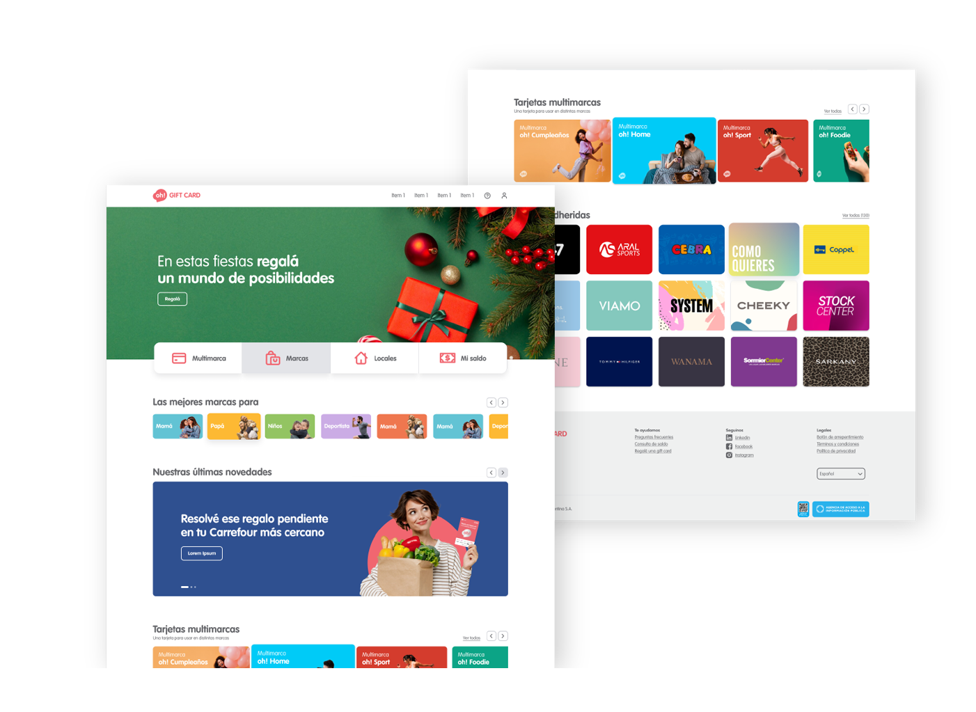
Project Summary:
This project focused on creating and optimizing the user experience for the commerce of the company. Our main objective was to enhance the interface and usability of their digital platform. To achieve this, we focused on defining and applying cohesive and appealing visual and functional elements.
Research and Discovery:
We utilized a variety of research methods, including user interviews, competitive analysis, and review of existing data. Key findings from this research directly influenced our design process, providing valuable insights into user needs and expectations.
Problem Definition:
We identified several specific challenges and issues facing the platform, such as navigation difficulties, lack of visual consistency, and overall usability issues. Clear and measurable objectives were established to address these issues and improve the user experience.
Ideation and Design:
Through brainstorming sessions and team collaboration, we developed creative and effective solutions. We created wireframes and prototypes to visualize and test our ideas before implementation.
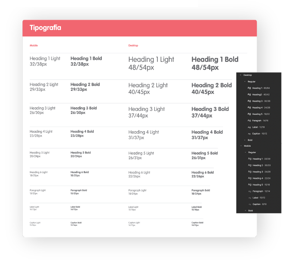
We defind typographic sizes for headlines, paragraphs, labels, captions. We make well-named dynamic styles in figma to use in components.
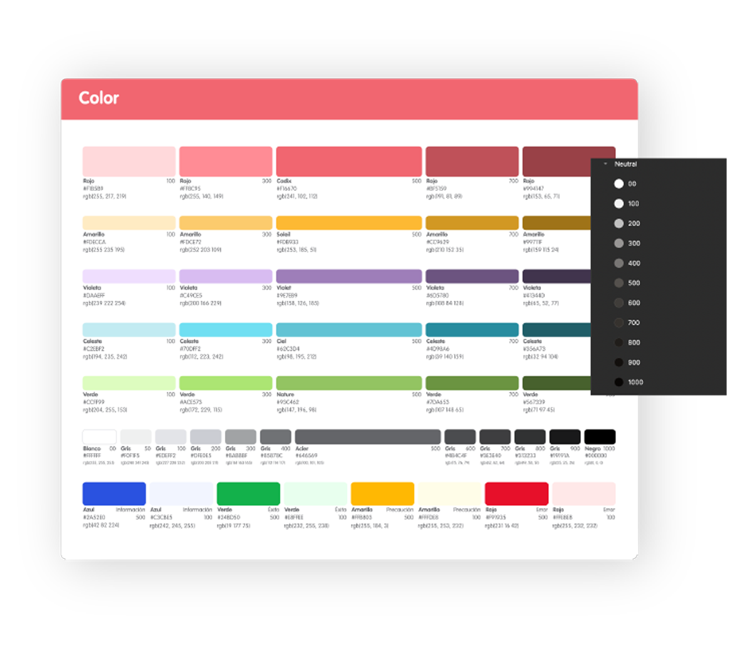
Using the color palette that the company already had, color tones were thought out. Four colors outside the palette were also considered as colors of alert, information, caution and success and their variants. All structured with the corresponding hexadecimal and dynamic styles applied to the figma.
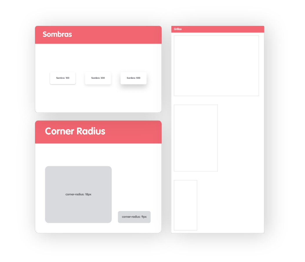
Armed with other definitions such as Shadows, radius, grids. To apply in the design.
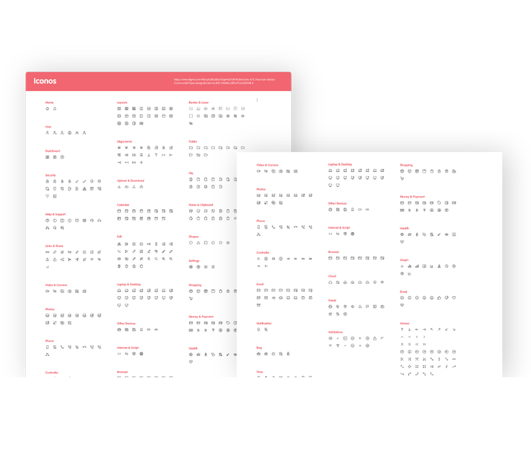
Select a family of icons and add those that are needed for the project.
Elements: Put together a list of universal icons. Taking into account that they are easily adaptable to the MUI component library
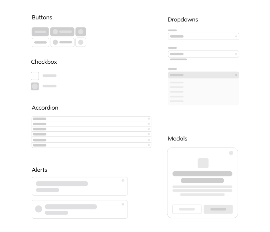
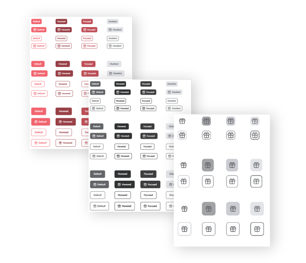
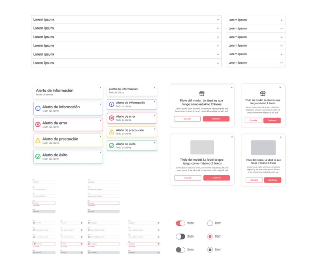
Components: With the elements listed and designed in low fidelity, the process of assembling high fidelity components begins, with their variants and different states and sizes for different devices.
Components: With the elements listed and designed in low fidelity, the process of assembling high fidelity components begins, with their variants and different states and sizes for different devices.
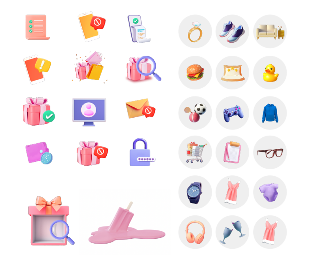
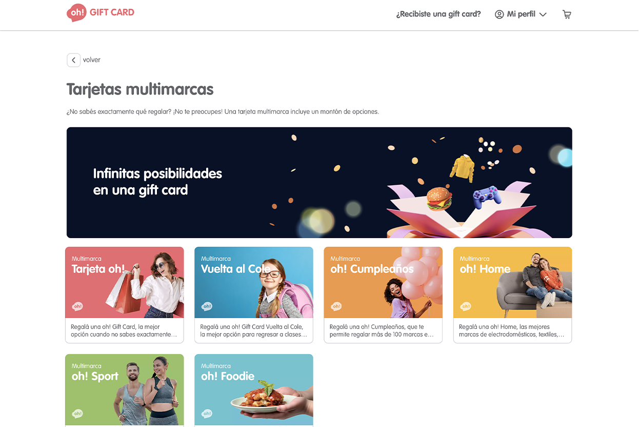
Also in parallel we were working on an illustration system that combined some photographs in shutterstock and generation of images by artificial intelligence Midjourney
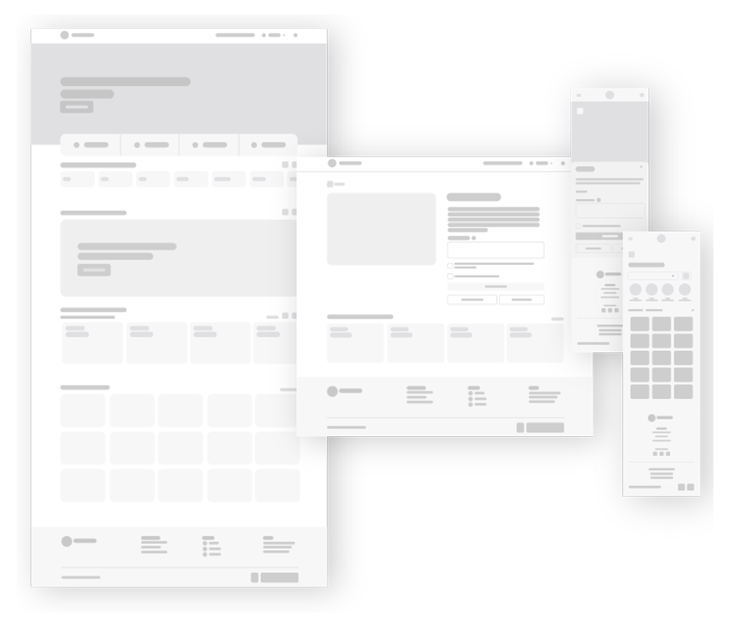
Then taking into account the previous research (of which unfortunately I do not have the material to show since I did not take the FigJam, only some Figma) the roadmap, user journey, user person, and some interviews from the previous site, drawing some conclusions, we made wireframes per screen, both for mobile and desktop.
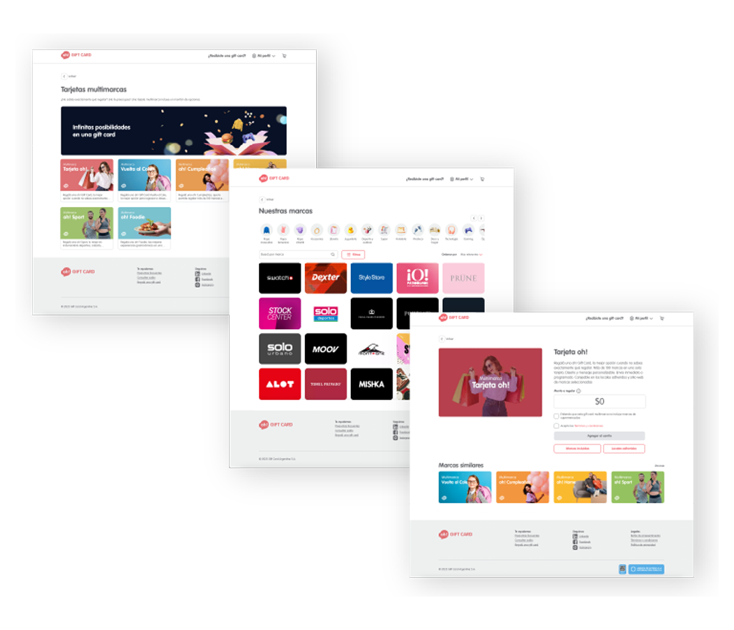
At the end of the project we reached the high fidelity stage. Here are some screens in its desktop version.
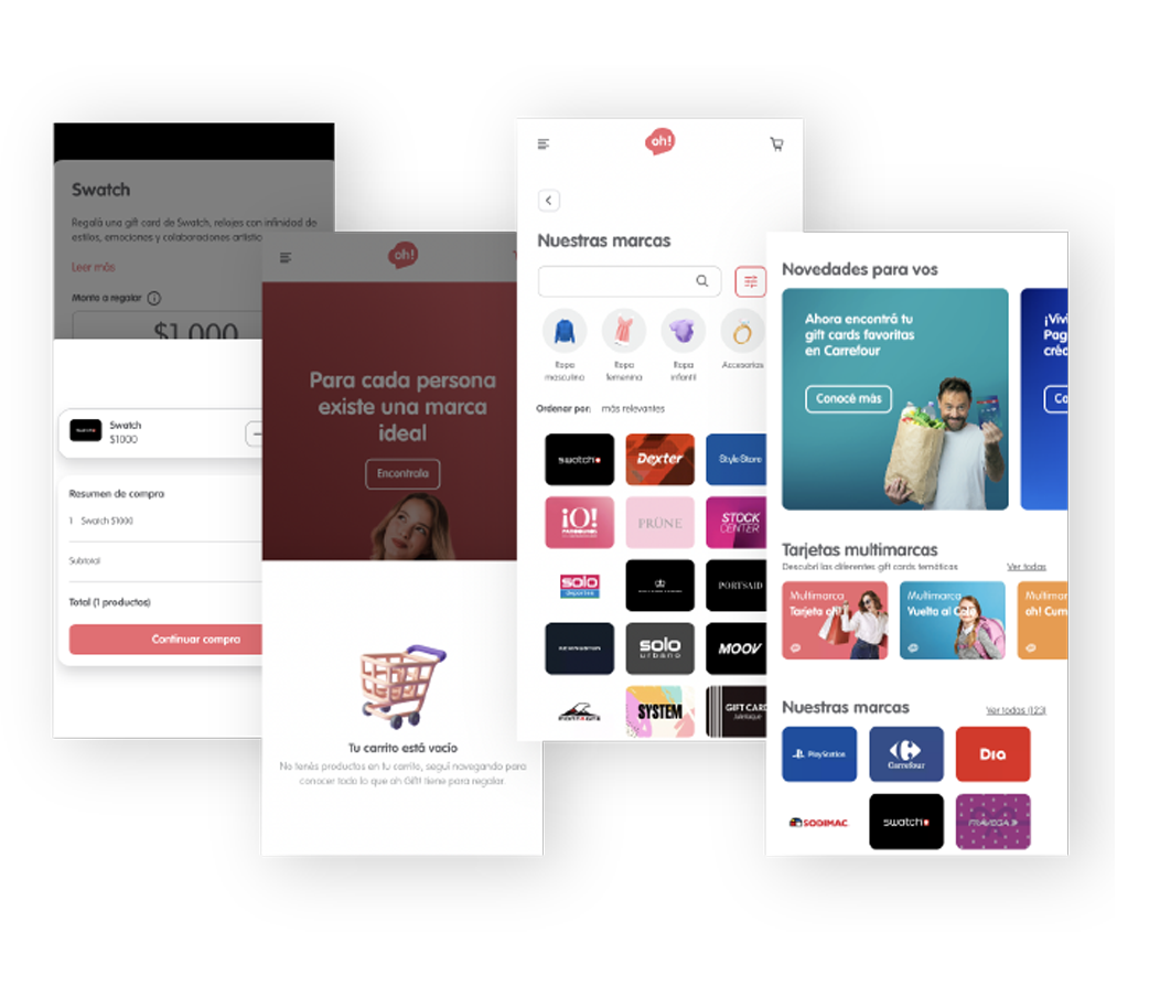
At the end of the project we reached the high fidelity stage. Here are some screens in its mobile version.
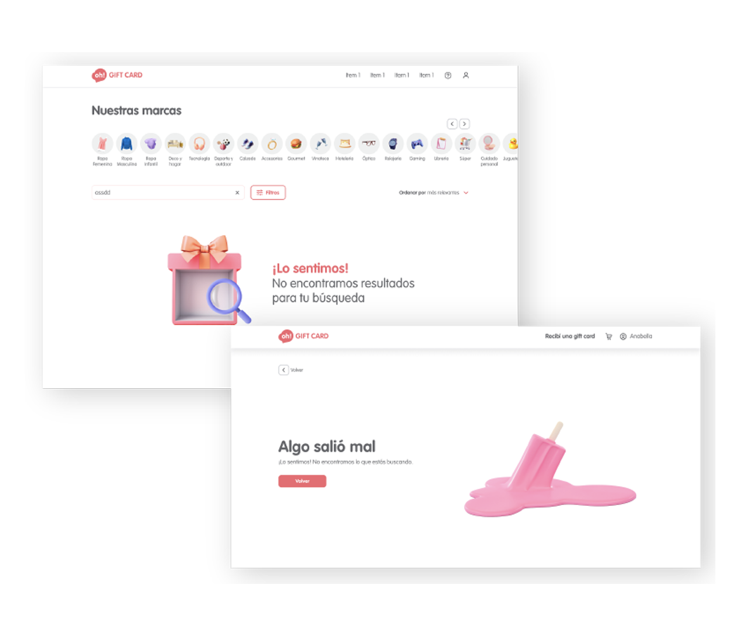
I wanted to make illustrations that have some kind of game, playful with gifts with things that make us happy.